Moldable Studio work viewer
01 / 06
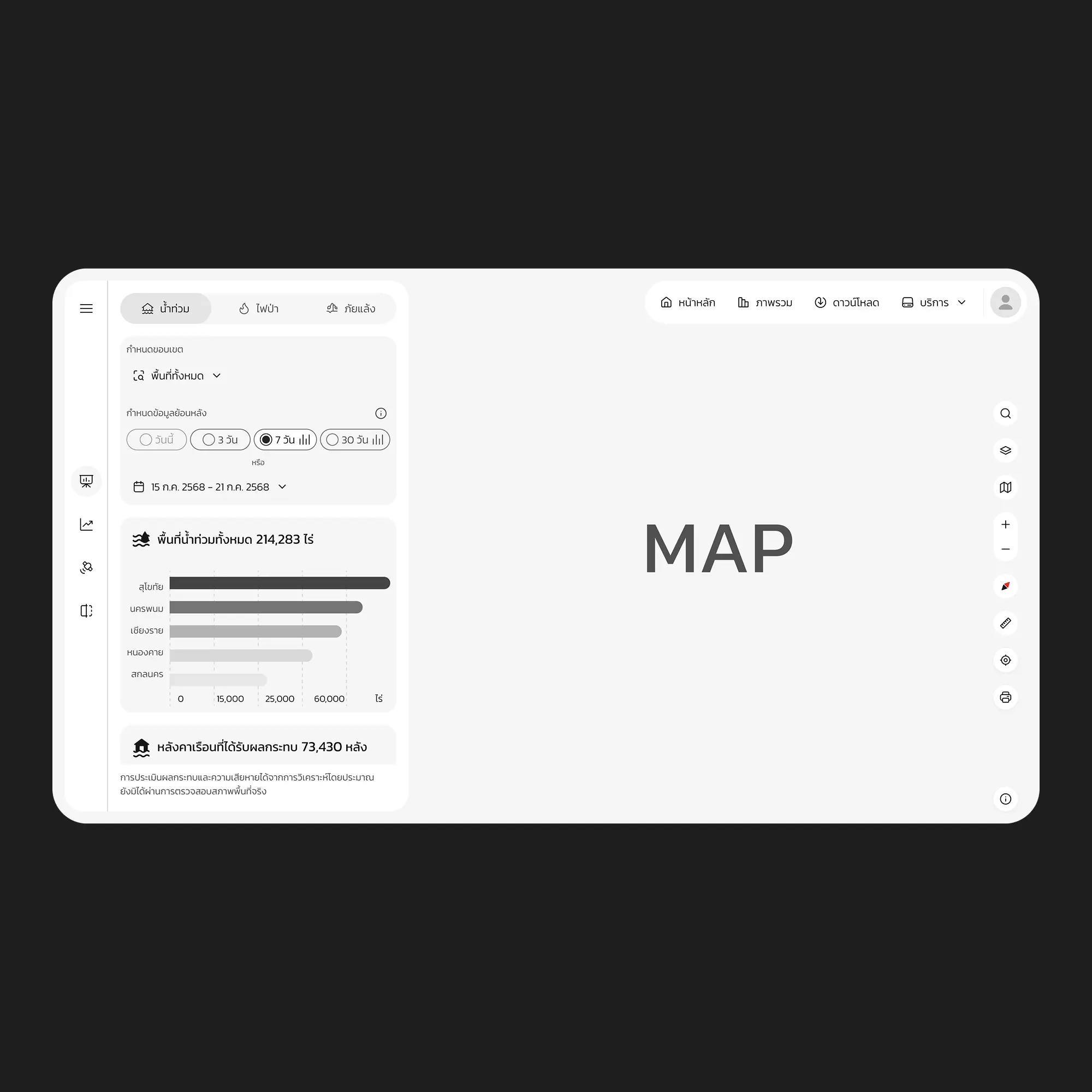
Disaster Platform
A national disaster monitoring platform that turns flood, wildfire, and drought data into decisions teams can act on within minutes.
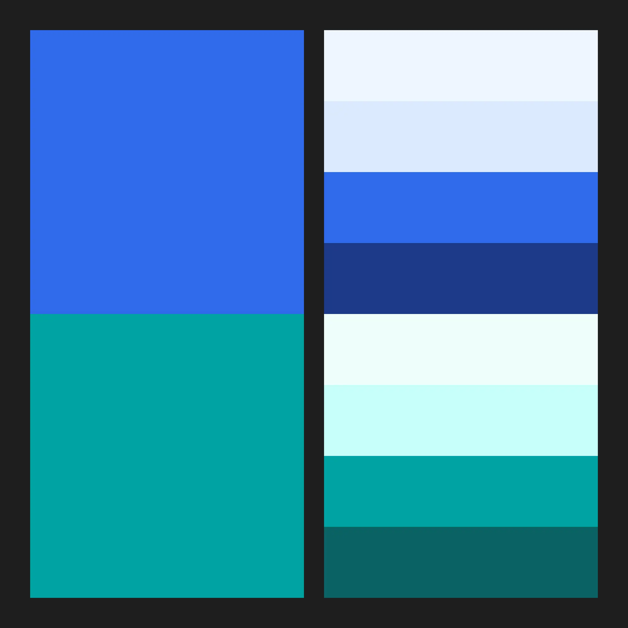
Designing clarity for complex disaster data
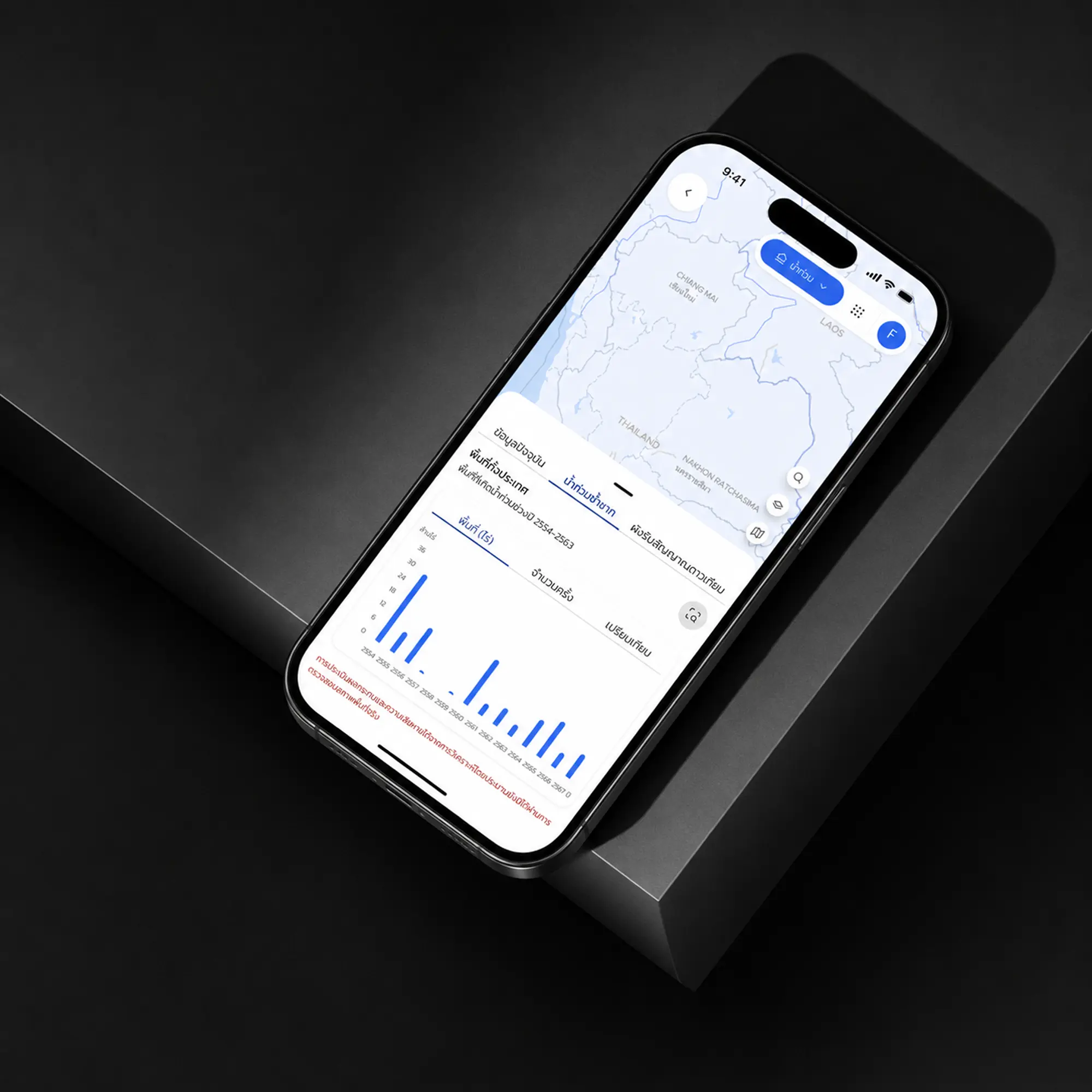
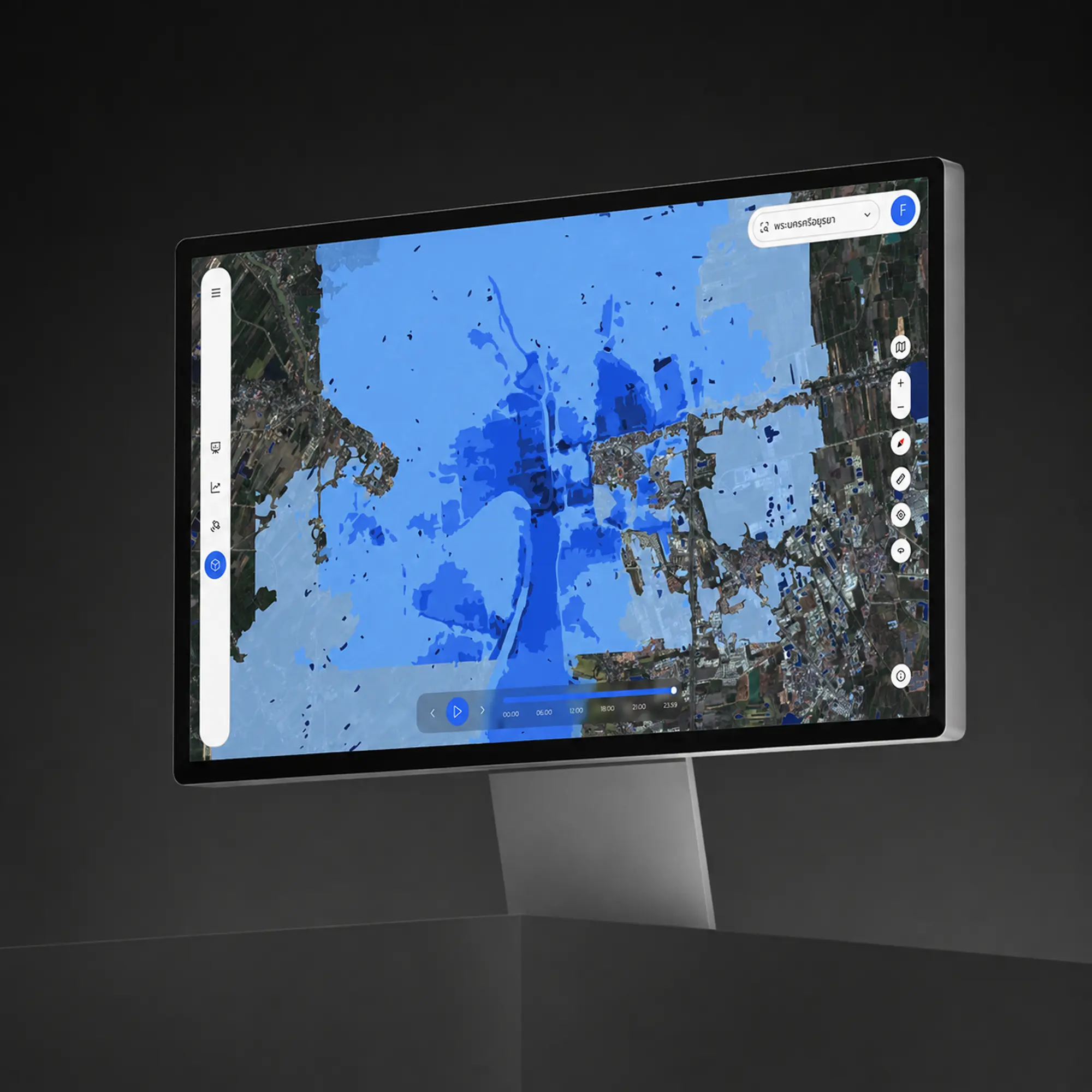
Disaster Platform brings multiple layers of disaster information into one clear operational experience. The interface is designed to help teams move from complex geospatial data to useful decisions without forcing them to interpret every dataset manually.
We focused on information hierarchy, map readability, interaction patterns, and consistent visual language across the product. The goal was to make high-density information feel understandable, actionable, and calm — especially when users need to respond quickly.
02 / 06
Dragonfly
A product experience built around clarity — dense operational data made calm, learnable, and quick to move through.
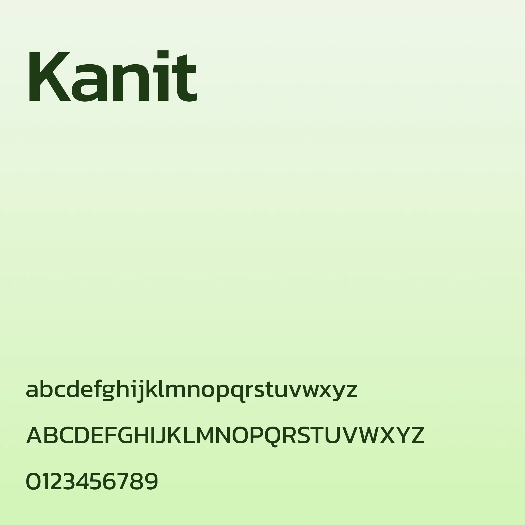
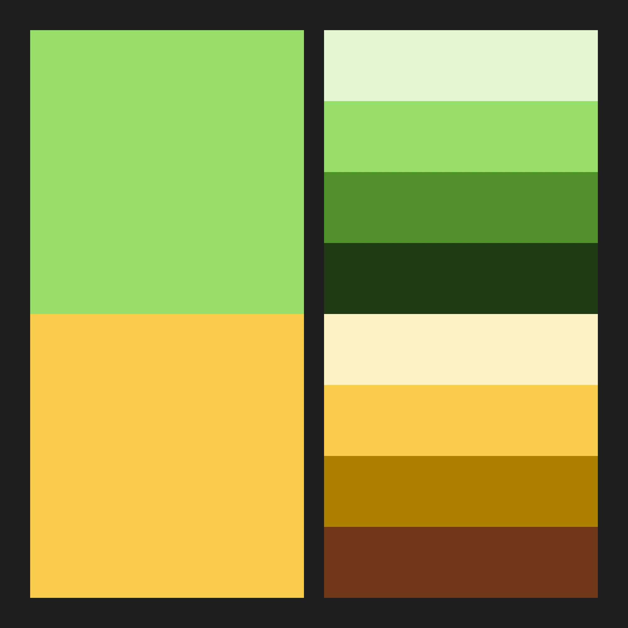
Turning complexity into a product people can move through with confidence
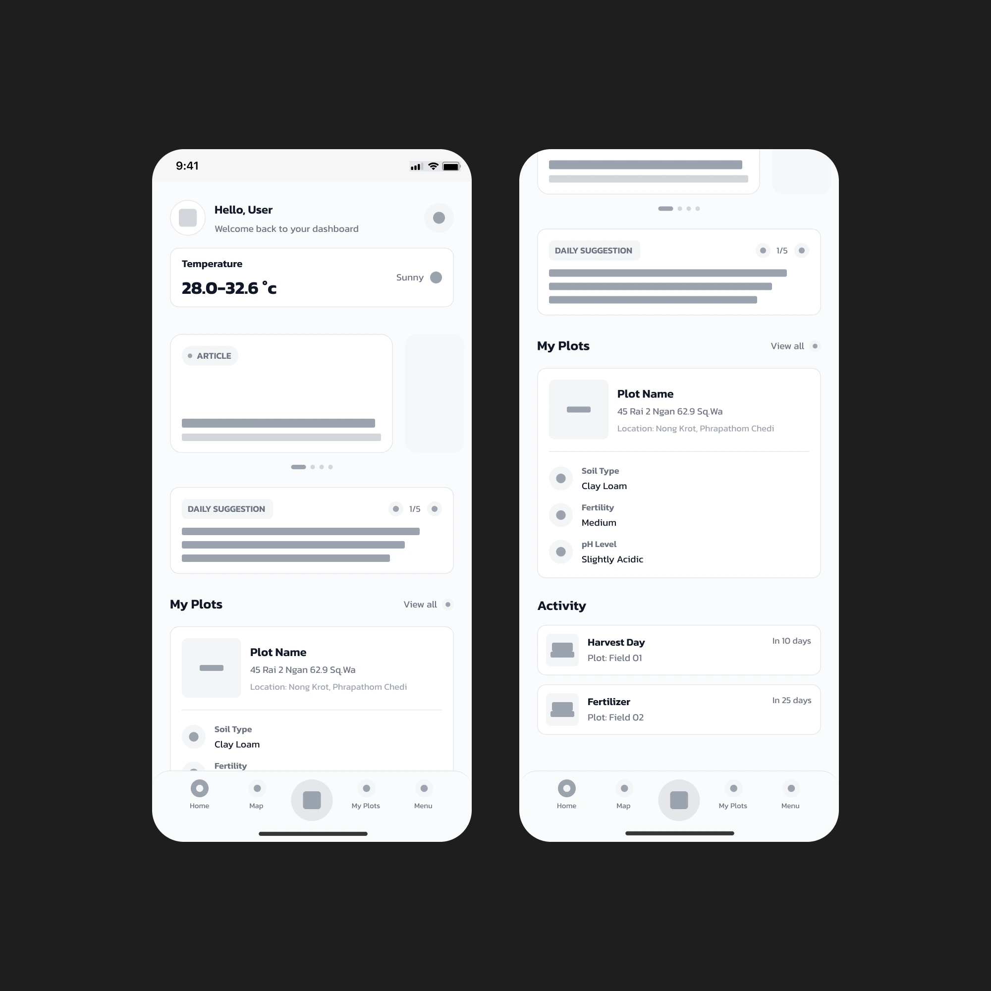
Dragonfly was shaped around a simple challenge: complex operational information should not make the experience itself feel complex. When products contain dense data, multiple workflows, and frequent decisions, clarity becomes part of the product — not just a visual preference.
We focused on information hierarchy, navigation, interaction patterns, and reusable interface systems that help users understand what matters and move confidently from one task to the next. The result is an experience designed to feel structured, learnable, and calm even when the information behind it is complex.
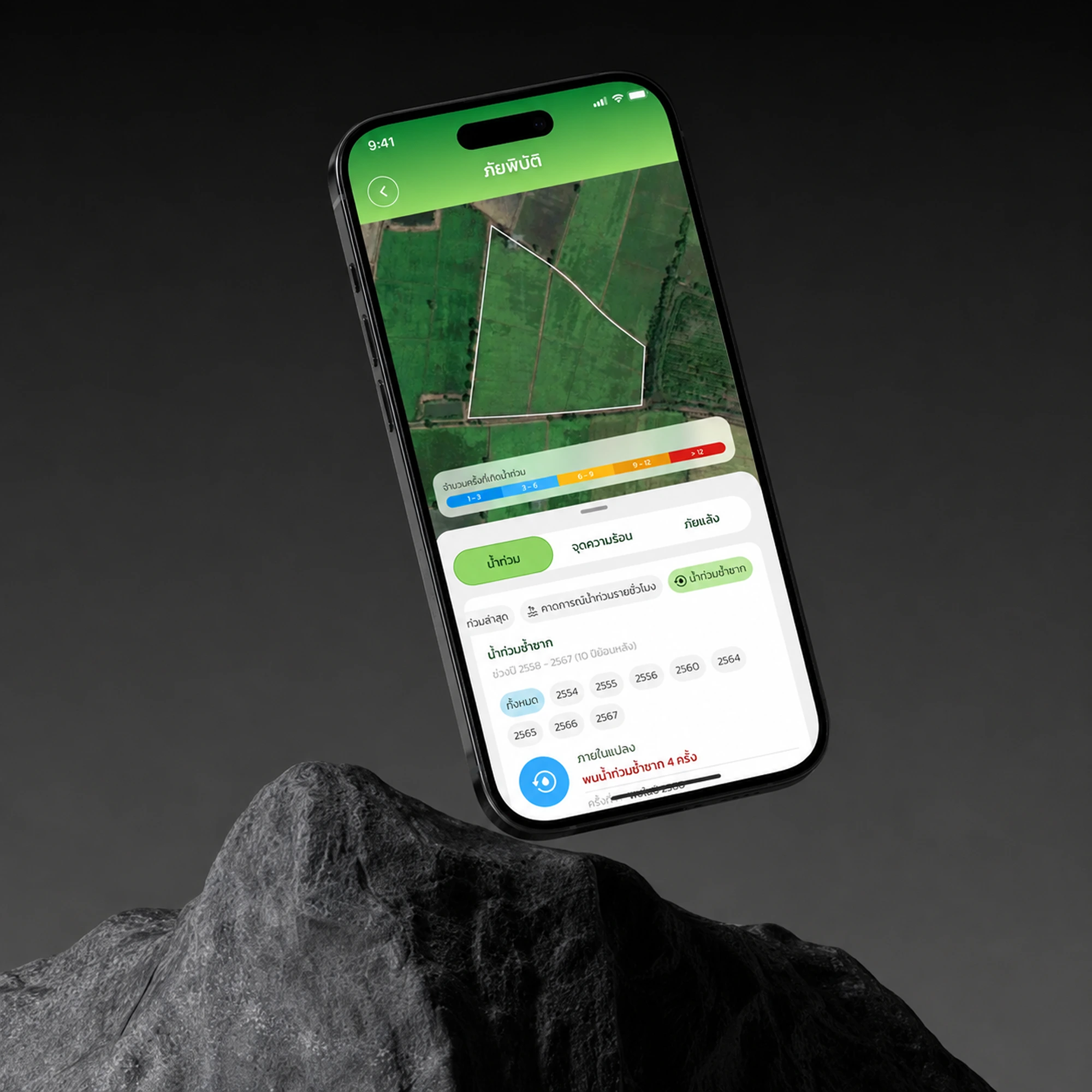
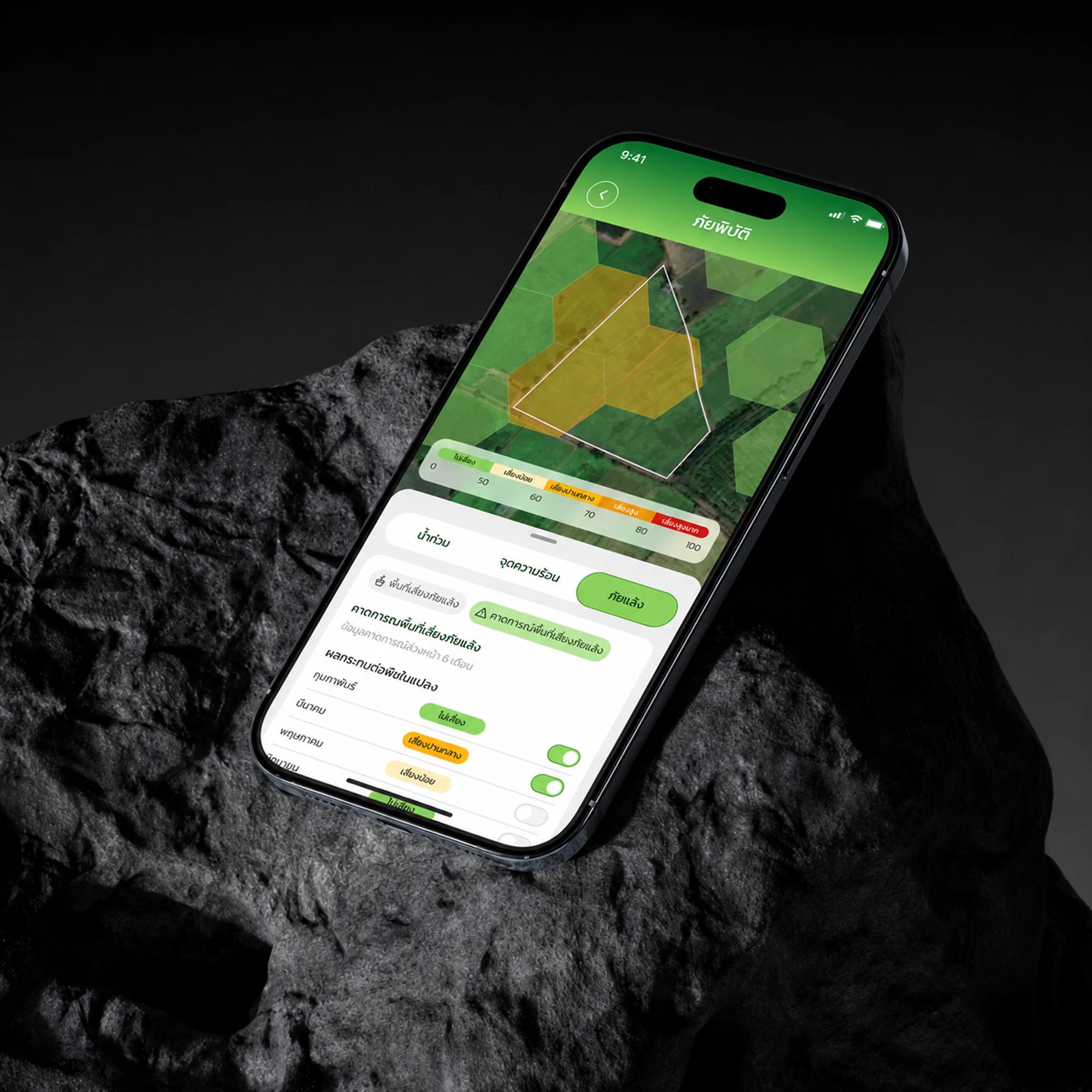
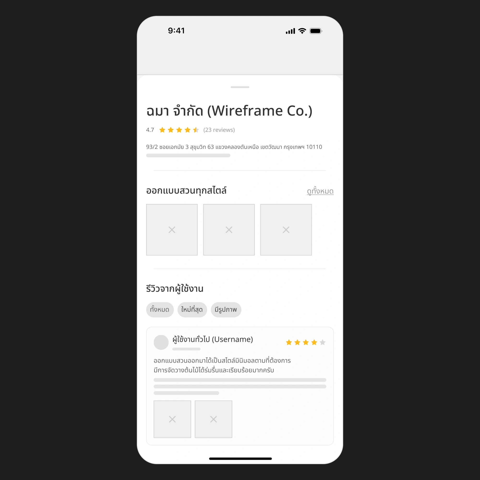


Designing useful information around real-world decisions
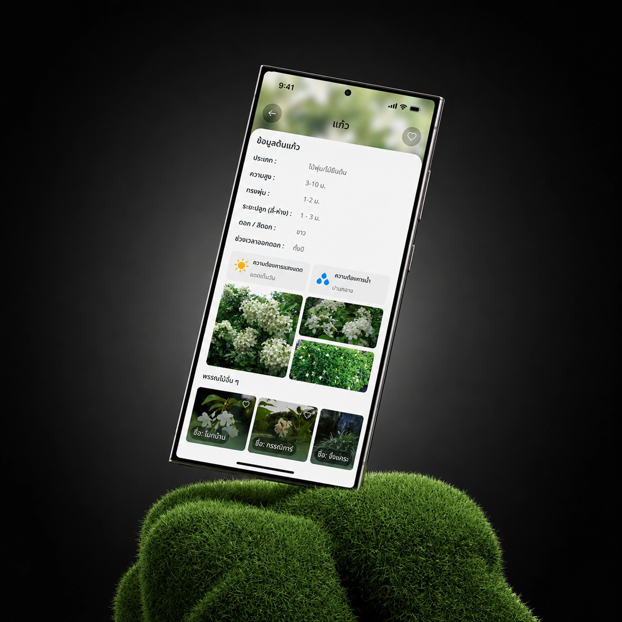
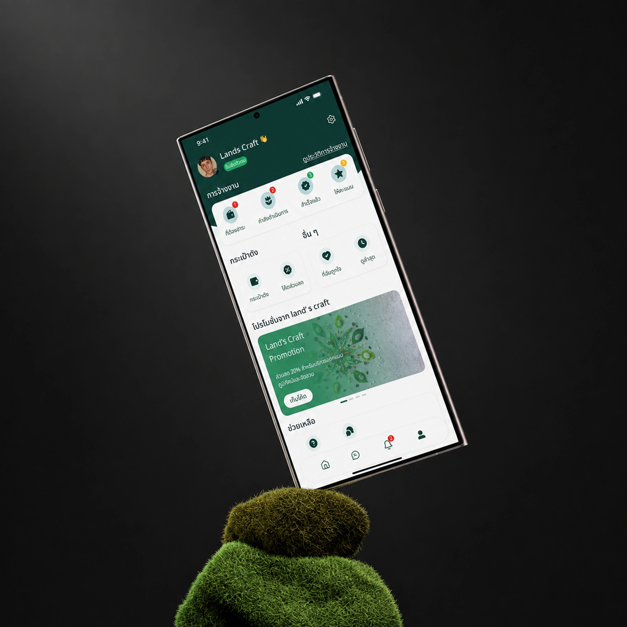
Land’s Craft explores how digital products can make information about land, environment, and everyday decisions easier to understand. Instead of presenting users with disconnected data, the experience is designed to bring relevant information together in a form that feels clear and immediately useful.
We focused on reducing cognitive load, creating understandable information hierarchy, and designing interactions around the decisions people actually need to make. The interface aims to connect complex information with practical actions while keeping the overall experience simple, approachable, and consistent.
04 / 06
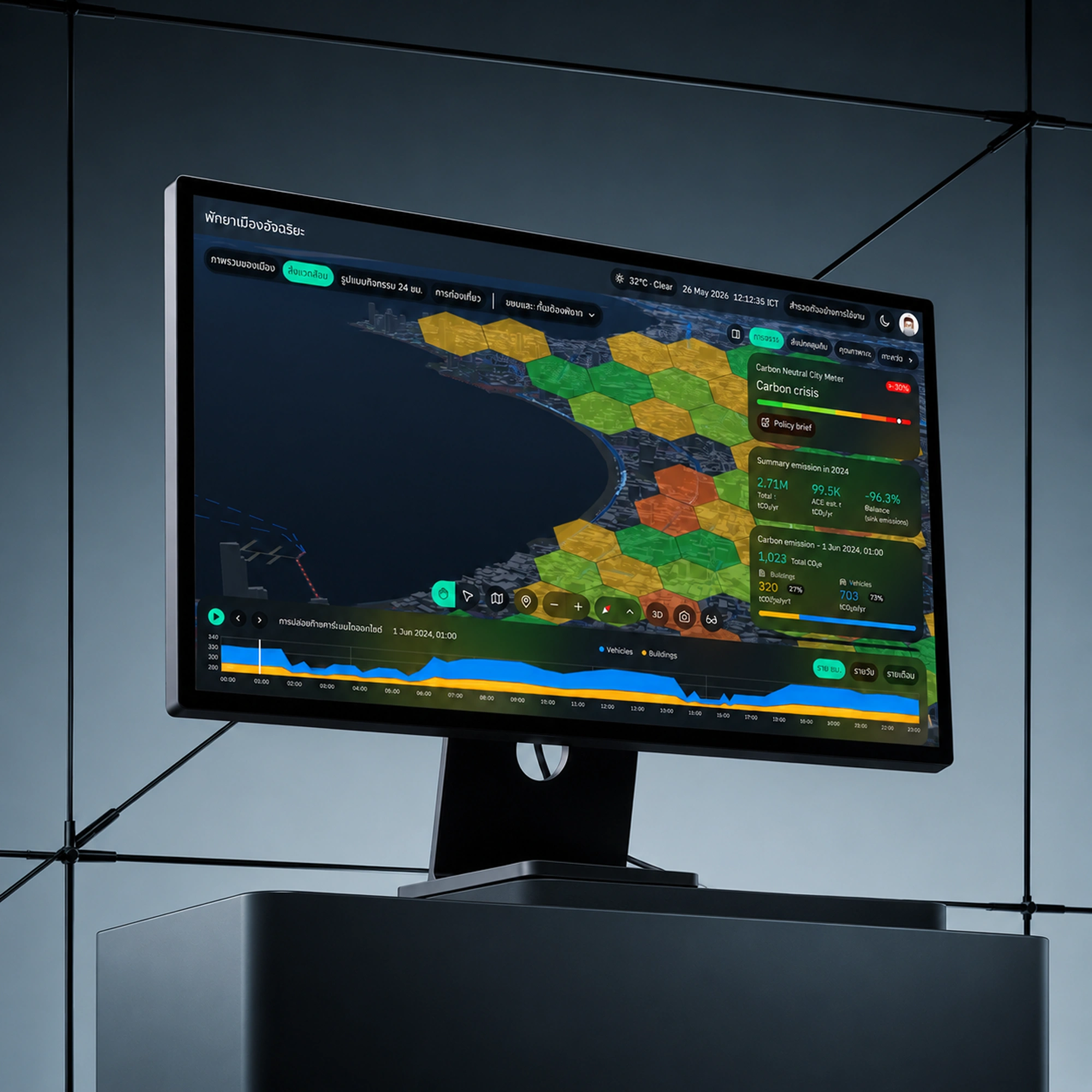
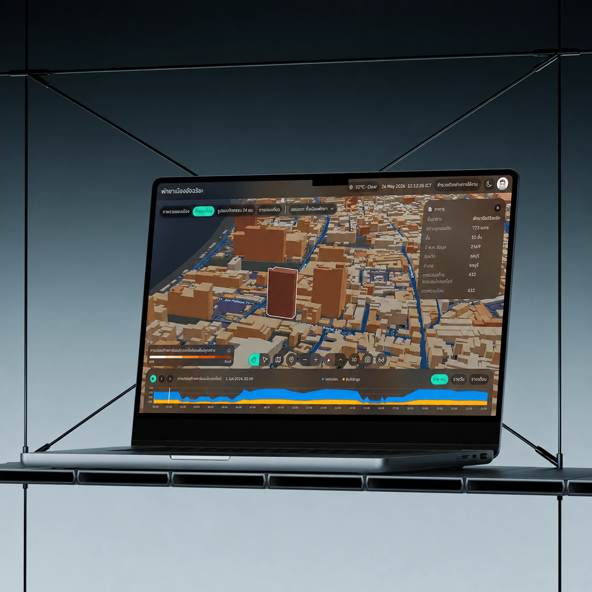
Geospatial Digital Twin
A geospatial digital twin that brings terrain, assets, and live telemetry into one navigable model of the real world.
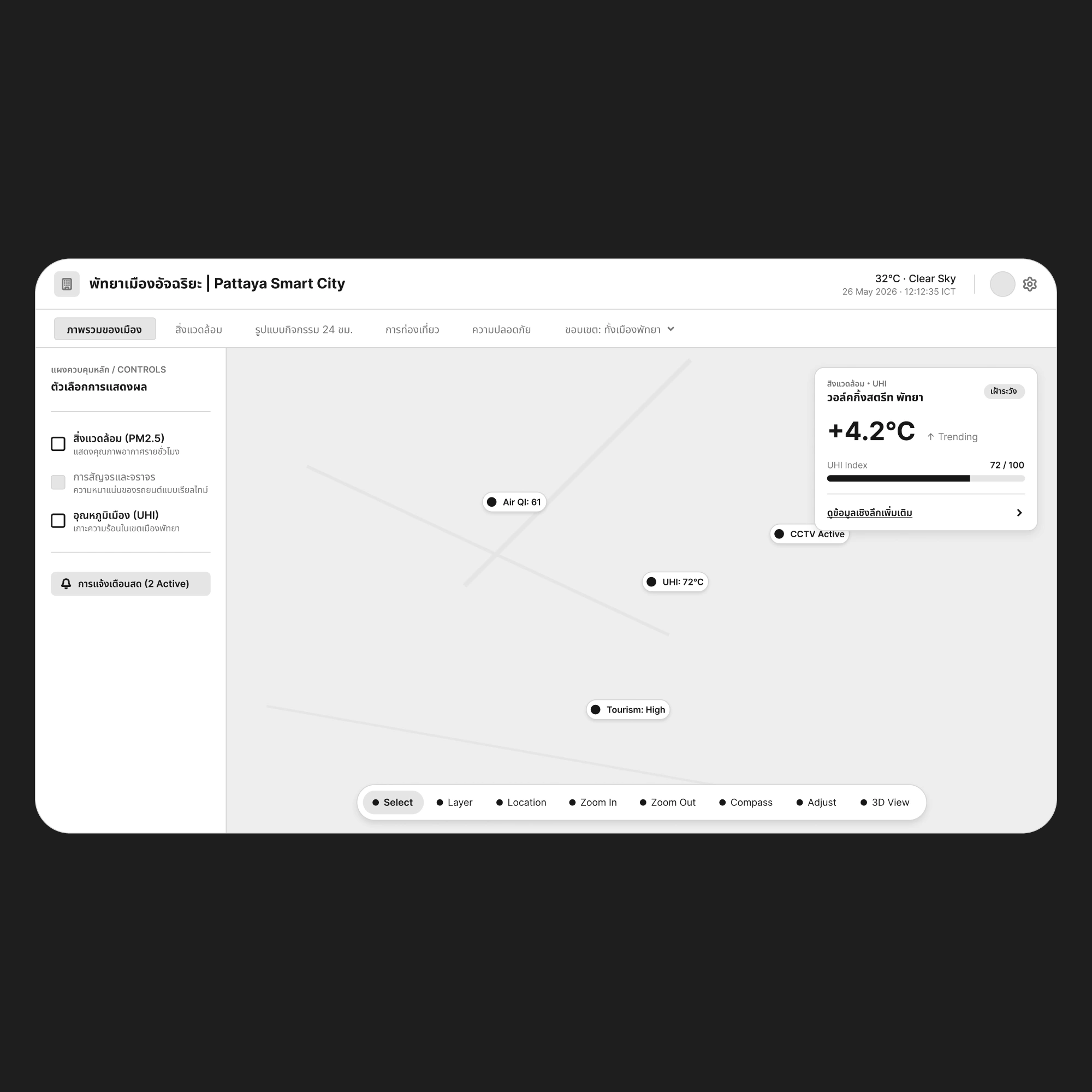

Making complex places and systems easier to understand
A digital twin can bring together many layers of information, but simply showing more data does not automatically create better understanding. The experience needs to help people see relationships, explore context, and move between different levels of information without losing orientation.
We designed the experience around spatial clarity, progressive disclosure, and consistent interaction patterns. The goal was to turn complex geospatial information into an interface that supports exploration and decision-making while keeping the experience understandable, focused, and approachable.

Structuring dense information into a clear digital experience
NSDC brings a large body of institutional information into a single digital experience. Rather than presenting every dataset at once, the interface is designed to guide people toward what is relevant to them, so that dense material becomes something they can read, compare, and act on.
We focused on information hierarchy, consistent navigation patterns, and a visual system that stays legible across content-heavy screens. The goal was to keep the experience calm and structured, so that depth of content never comes at the cost of clarity.
06 / 06
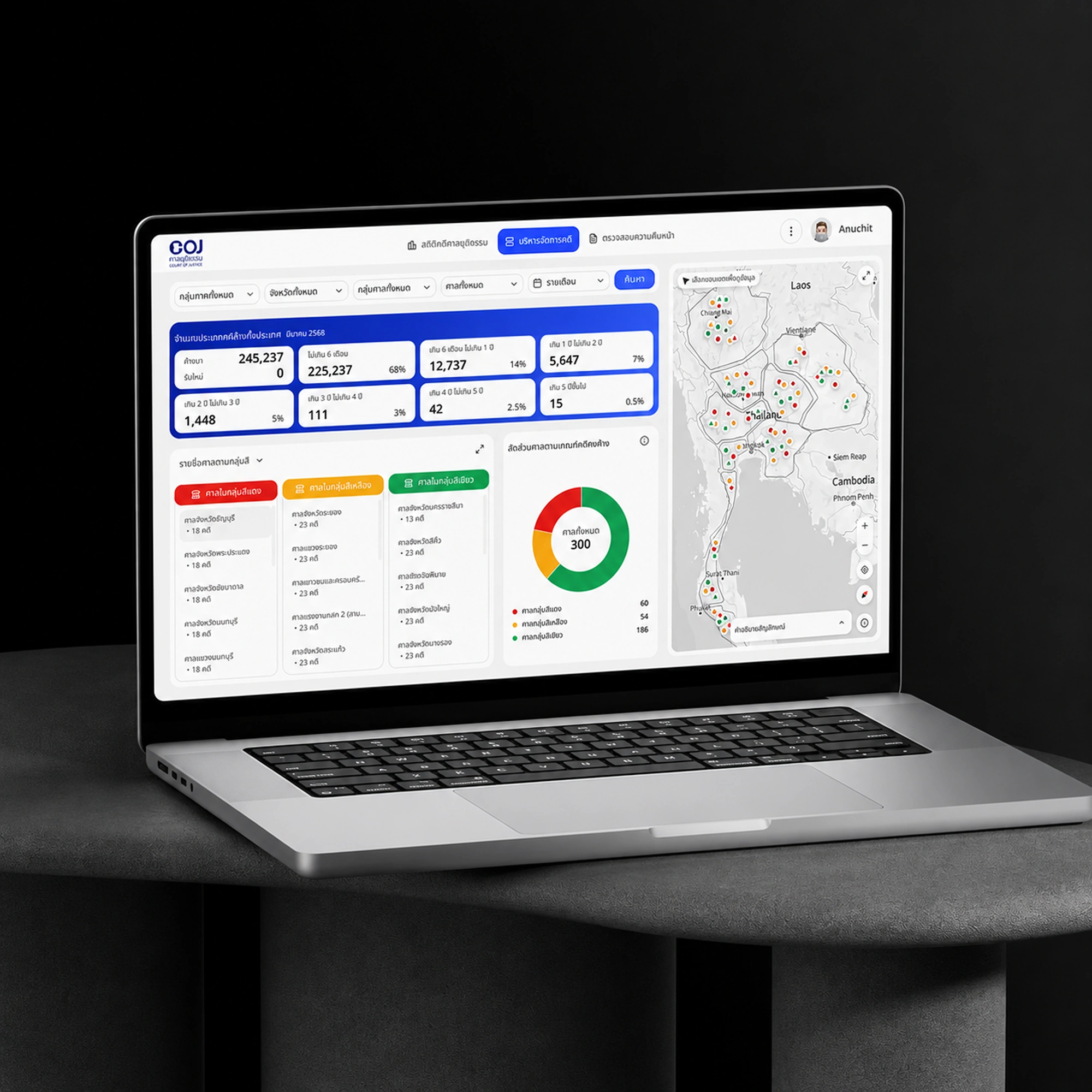
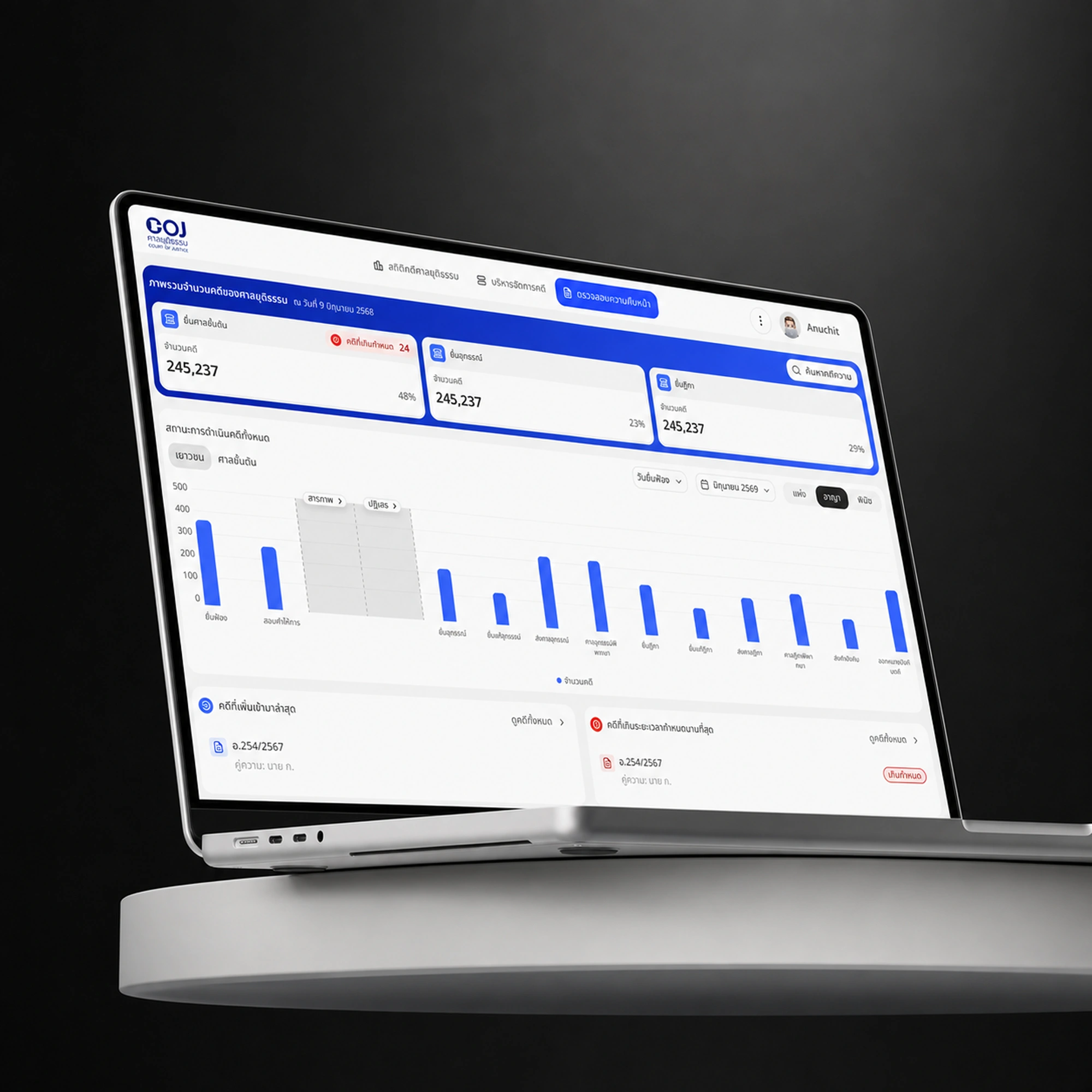
Court of Justice
A digital experience designed to make judicial information and services clearer, more accessible, and easier to navigate.
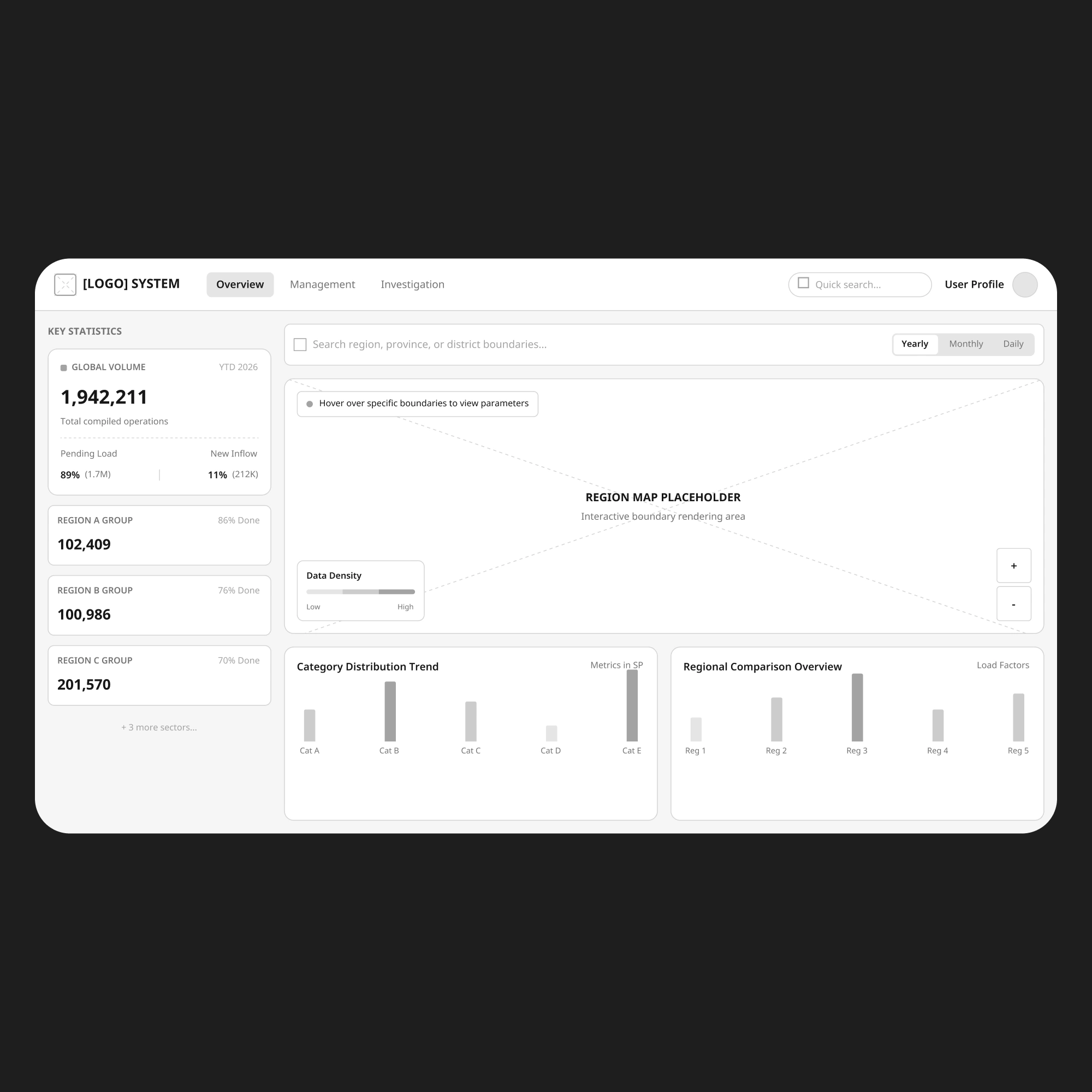

Making judicial information clearer and easier to navigate
Court of Justice explores how complex legal and public-service information can be transformed into a more understandable digital experience. Judicial services involve dense information, multiple user needs, and processes that are difficult to follow, so the challenge was to create an experience that feels trustworthy and structured while reducing unnecessary complexity.
We organised information around user needs, clarified the key journeys, and designed a consistent interface system that supports both accessibility and ease of use. The result is a clearer foundation for reaching judicial information and services, with a scalable structure that can carry future content and functionality.