Moldable Studio work viewer

01 / 01

Moldable Studio

Studio’s branding that aspire to be a digital product design studio that values "experience" alongside "beauty" and "flexibility" of design.

  • Brand Experience

The name "Moldable" comes from the belief that good design should be carefully molded with intention, like a work of art that is gradually built from ideas, collaboration, and meaningful little details.
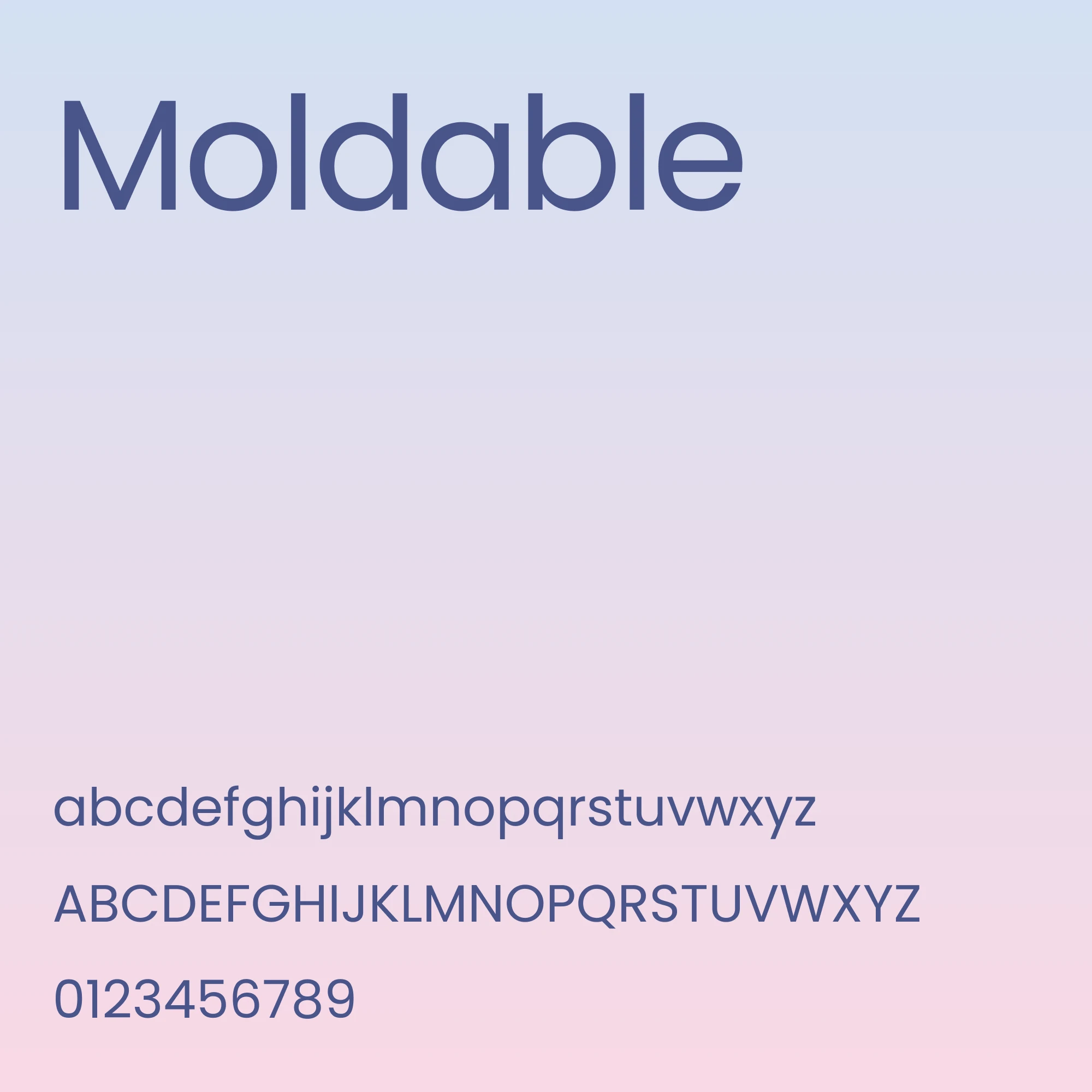
Moldable typography specimen: the wordmark “Moldable” above the full lowercase and uppercase alphabet and the numerals 0–9, set in periwinkle blue on a soft blue-to-pink gradient.
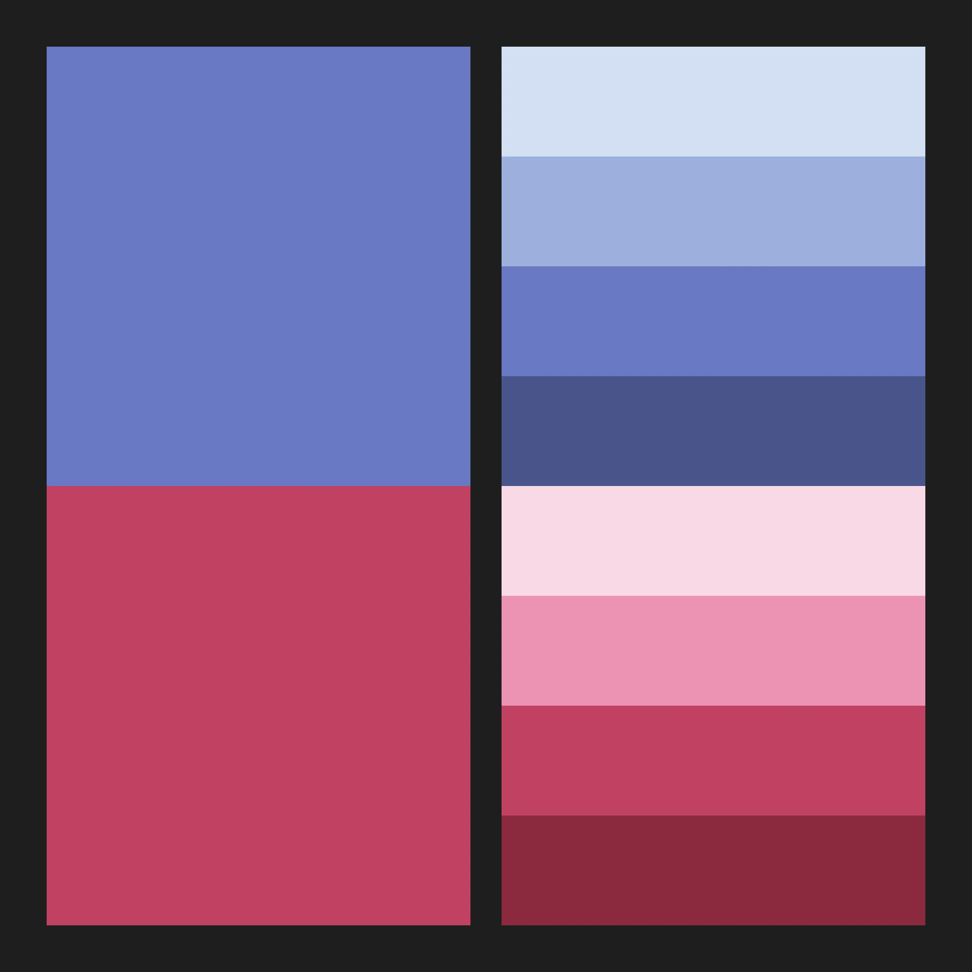
Moldable colour palette: a periwinkle blue primary and a raspberry red secondary, each shown with four tints and shades.
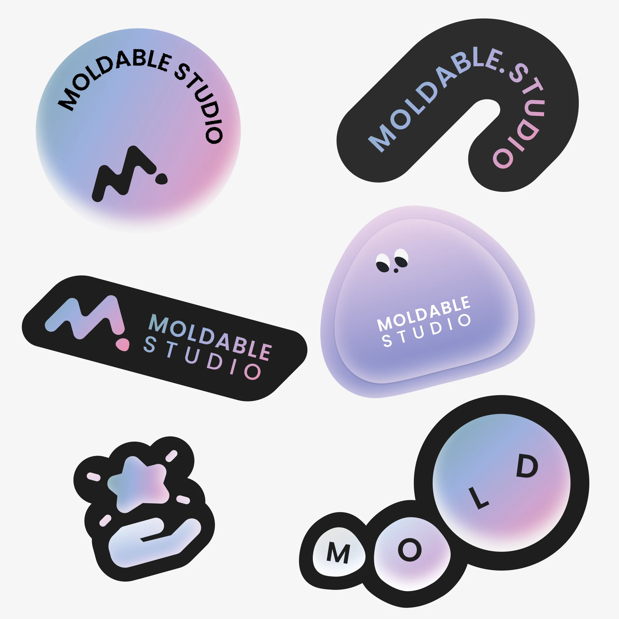
Moldable Studio sticker set: round, pill and blob-shaped stickers with the M logo, the studio name and a small character, in gradient and black finishes.

We are committed to designing experiences that are flexible, clear, and meaningful — from Brand Experience and Customer Experience to UX/UI Design and Service Experience.
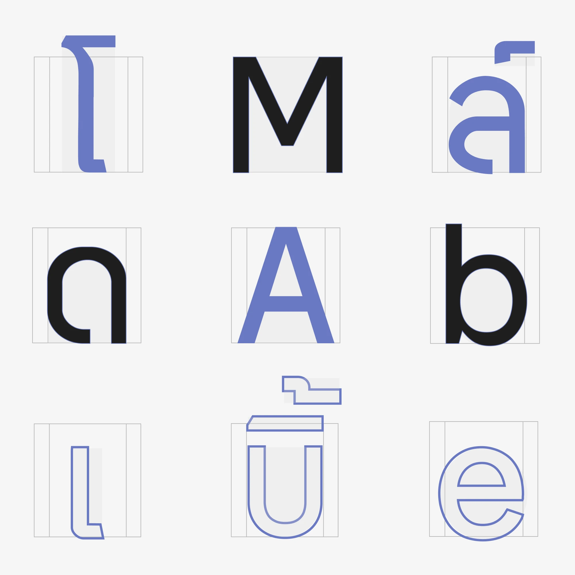
Brand typeface letterforms on construction grids, pairing Latin letters such as M, A, b and e with Thai characters.
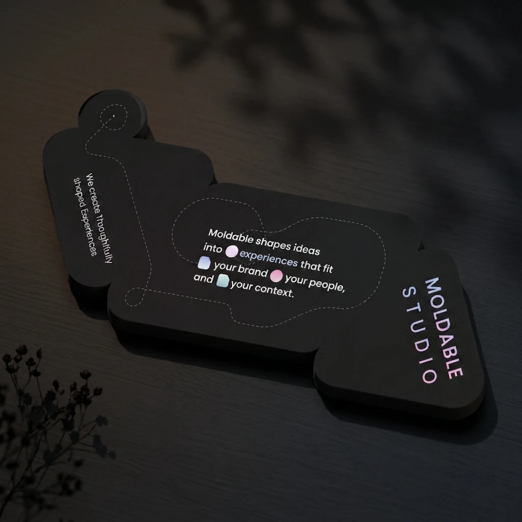
Die-cut black Moldable Studio business card with gradient icons and the line “Moldable shapes ideas into experiences that fit your brand, your people, and your context.”
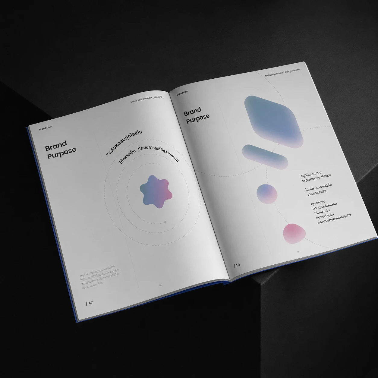
Open Moldable brand guideline brochure showing the Brand Purpose spread with soft gradient shapes.
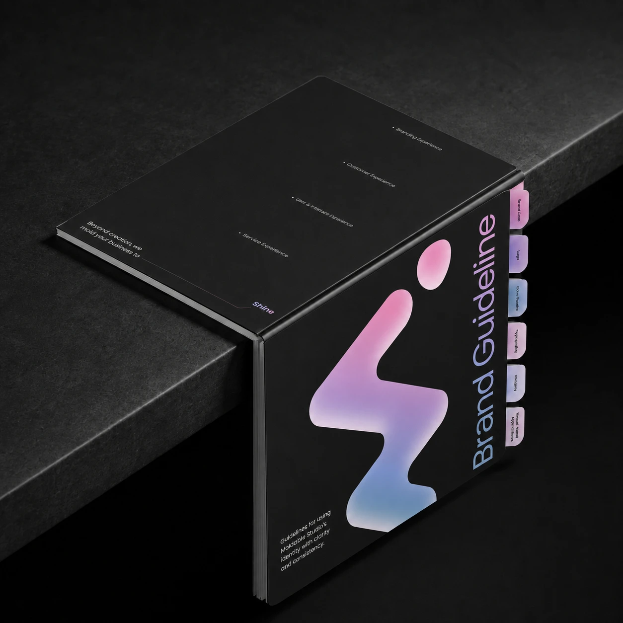
Black Moldable Brand Guideline box with the gradient M logo and colour tabs, resting on the edge of a dark plinth.
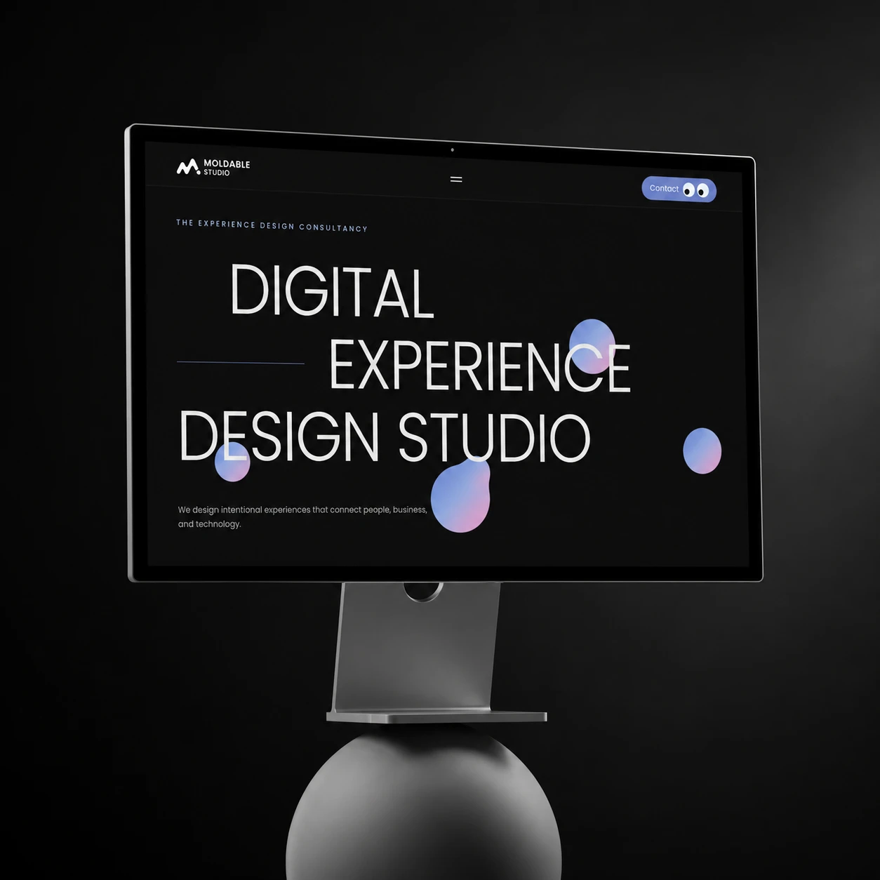
Moldable website on a monitor, with the headline “Digital Experience Design Studio” and floating gradient shapes.